
As a result I will have to position text to distract the viewers eyes.


I also used the gradient tool to darken the entire poster and I feel this looks much better. Also I feel this will help the colour scheme (Red , Grey and White) to stand out more.
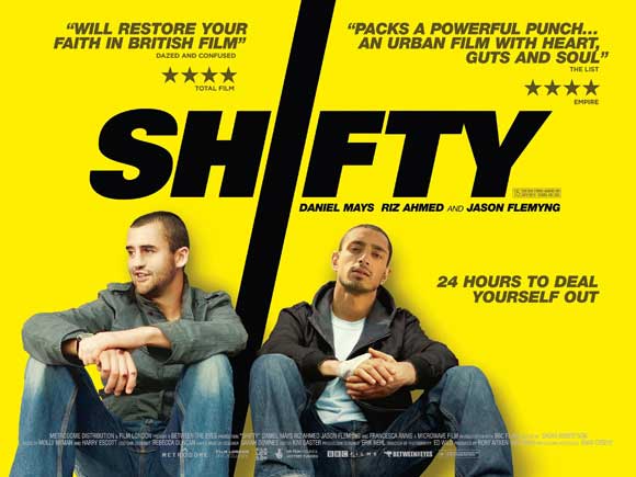
Finally I have decided to keep the original title design from our very first draft. The idea for this came from the film posters of 'Seeking Justice and 'Shifty'. I feel that this design help to make the title stand out more but also makes our poster more distinctive.
Here is the images of the 'Seeking Justice' and 'Shifty' Poster which were inspirations for our title design:
I hope to add in some original text tomorrow in order to distract the viewers eyes from the manipulation.
No comments:
Post a Comment