From our research we found that most production companies had a clear and simple logo with something that made them stand out. Take a look at the images below for example:
 |
| The Lion on this logo is instantly recognisable |
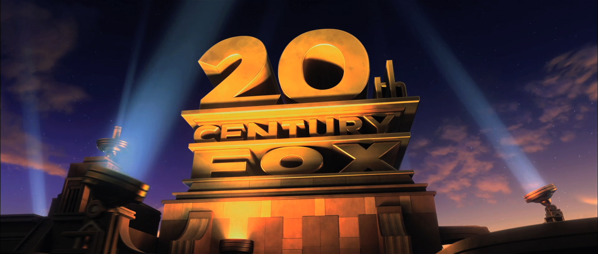 |
| The Typography is shaped around a building which makes it instantly recognisable |
 |
| The mountain and the stars are what makes this logo stand out and recognisaable |
| The Castle and unique Serif typography helps this logo to be instantly recognisable |
So from our research we then realised that we needed to have something to make our logo stand out but it also need to be clear and simple and relative to our company.
 Here is our first proposed company logo. We liked this logo because it was simple , clear and recognisable which is what we said our logo needed to be upon reflecting on our research . It was recognisable because of the use of an old film reel image. However upon reflection and discussion with our classmates we realised that this was also the problem. Our film company is meant to be modern and a film reel is certainly not that. We then thought about replacing it with an image of a dvd/cd which is more modern however it just did not have the same effect
As a result we then decided to scrap that idea and go for something completely different.

This was the resulting production logo:
We liked this for 3 main reasons:
> It is very modern and stylized
> It is unique which is what we as a production company strive for
> It is instantly recognisable for viewers
No comments:
Post a Comment