Okay so as we have changed our idea, we have also decided to give you an update on our new plot:
Lorenzo and Sean are prospective 100m sprinters who have dreamed of competing in the 2016 Olympics there whole life. They extensively train each other in order to better themselves, however Lorenzo takes the wrong path and resorts to selling drugs and violence etc. During this time Sean continues his training with his new coach however it doesn't feel the same. The challenge is to see whether Enzo can bring himself back and whether Sean can improve himself without the assistance of his best mate
Showing posts with label Research and Planning. Show all posts
Showing posts with label Research and Planning. Show all posts
Wednesday, 11 December 2013

Tuesday, 10 December 2013
Change
CHANGE FOR THE BETTER
???
We have decided to completely change our idea. After a bit of analysis of our blog and our ideas, we felt that our film was at risk of becoming too similar to Shifty. In addition we felt that our character did not have a way out and this was one of the key connotations of the social-realist genre films that we found through our trailer.
As a result we have decided to focus our new trailer on athletics. This is because the London 2012 Olympics was obviously a big thing for Londoner's especially East Londoners such as ourselves. In addition we felt that people were more interested in athletics as a result of the London 2012 Olympics and so we want to appeal to this audience.
OUR NEW PLOT
Two best friends (Lorenzo and Sean) share a dream of competing at the 2016 Olympics in Brazil. They both come from urban areas within London. However Sean avoided the conflicts around him such as drugs , gangs and violence (which are stereotypical of London Youths) whereas Enzo got drafted into smoking and the his dream represents his chance to escape. However Sean gets caught with Lorenzo's girlfriend and they now become rivals chasing the same dream.
Sunday, 17 November 2013
Synopsis
This is the synopsis of our film :
We still have not came up with a definite title but we do have our plot complete
After the death of his best friend Lorenzo, Sean is faced with a tough challenge. He has 72 hours to give the gang (who he thinks killed Lorenzo) £2,500 Cash or he faces the same fate as Lorenzo.
In order to acquire this cash he turns to a life of drugs , which involves one big deal destined to go wrong. The irony of the fact that he is turning to drugs is that , in order to try and save his life he must risk it even further.
Thursday, 14 November 2013
Title research


We have chosen to choose our titles to be
serif fonts for the movie. This is because it relates to genre as it is bold
and has a design to it, this relates to the genre as social realism movies are
seen to be bold and straight to point as it is real life based stories. The
font also relates to our characters as they are drug dealers which bold serif
fonts demonstrates that type of effect.
Wednesday, 13 November 2013
Aidem Productions Animated Storyboard 1
Today we finalised our first animated storyboard. It is very short and we have used rough images from online but we hope it will help us when filming as it will allow us to know what shots we need. As well as providing us with an idea of timing for our shots. We also added our soundtrack to see how it fitted with the storyboard and we like it because the lyrics suit the storyboard/storyline in a way
AIDEM Animated Storyboard1 from Media @ St. Bons on Vimeo.
Monday, 11 November 2013
Production Logo
A production logo is very important for a film company as it is what makes the recognisable.
From our research we found that most production companies had a clear and simple logo with something that made them stand out. Take a look at the images below for example:
 Here is our first proposed company logo. We liked this logo because it was simple , clear and recognisable which is what we said our logo needed to be upon reflecting on our research . It was recognisable because of the use of an old film reel image. However upon reflection and discussion with our classmates we realised that this was also the problem. Our film company is meant to be modern and a film reel is certainly not that. We then thought about replacing it with an image of a dvd/cd which is more modern however it just did not have the same effect
From our research we found that most production companies had a clear and simple logo with something that made them stand out. Take a look at the images below for example:
 |
| The Lion on this logo is instantly recognisable |
 |
| The Typography is shaped around a building which makes it instantly recognisable |
 |
| The mountain and the stars are what makes this logo stand out and recognisaable |
 |
| The Castle and unique Serif typography helps this logo to be instantly recognisable |
So from our research we then realised that we needed to have something to make our logo stand out but it also need to be clear and simple and relative to our company.
 Here is our first proposed company logo. We liked this logo because it was simple , clear and recognisable which is what we said our logo needed to be upon reflecting on our research . It was recognisable because of the use of an old film reel image. However upon reflection and discussion with our classmates we realised that this was also the problem. Our film company is meant to be modern and a film reel is certainly not that. We then thought about replacing it with an image of a dvd/cd which is more modern however it just did not have the same effect
As a result we then decided to scrap that idea and go for something completely different.

This was the resulting production logo:
We liked this for 3 main reasons:
> It is very modern and stylized
> It is unique which is what we as a production company strive for
> It is instantly recognisable for viewers
Friday, 8 November 2013
Thursday, 7 November 2013


Target Audience
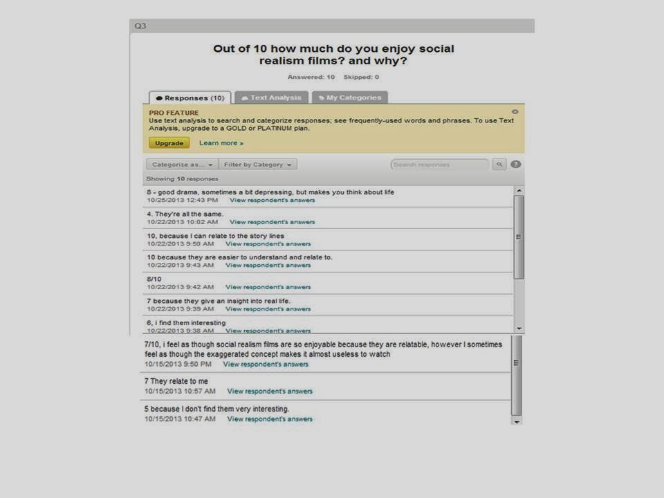
Social realism films tend to be aimed at a niche audience,
who often understand or can relate to the narrative.
With our film we have decided to aim our film to teenagers
to young adults (15-28), as this is the age group which consist of frequent
cinema goers. This age group were the same type of age group which watched
films like Bullet Boy and Kidulthood, as these film will often use exaggerated
stereotypes and exaggerated interpretations of the society we live in.
These type of social realism films aimed for the younger
generation, often showing the lives of lower/ working class people (C1-E) and
the problems that they struggle with in their lives. The audience can relate to
the characters as there isn't much of age difference between the characters and
audience.
 We will target our audience through different types of
convergent links like, websites and social networking platforms such as
Twitter, Facebook and YouTube. These social networking sites can stream our
trailer or have links to our website where they can find out more information on
the film and its cast. In addition to showing our trailer and giving
information, these social networking sites can help our film build some
reputation or 'hype' which will cause more people waiting for the release. As
these sites are commonly used by our target audience as this is how they
communicate with one another. Another way that we'll be targeting our audience
is through films posters and magazines. Our film poster will be located in
convenient places like in cinemas or on public transport.
We will target our audience through different types of
convergent links like, websites and social networking platforms such as
Twitter, Facebook and YouTube. These social networking sites can stream our
trailer or have links to our website where they can find out more information on
the film and its cast. In addition to showing our trailer and giving
information, these social networking sites can help our film build some
reputation or 'hype' which will cause more people waiting for the release. As
these sites are commonly used by our target audience as this is how they
communicate with one another. Another way that we'll be targeting our audience
is through films posters and magazines. Our film poster will be located in
convenient places like in cinemas or on public transport.Script Treatment
Sean, an intellectual eighteen year old is an aspiring athlete, along with his best friend Lorenzo who is also certain to get a place on the GB 2016 Olympic team. Both Sean and Lorenzo grew up in a rough and urban area, which has an effect on their personalities. Along with this they find it easy to fit in with the ‘popular’ and ‘cool’ students at college due to their talents.
Sean and Lorenzo spend their free time training and preparing each other for the Team GB 2016 Olympic try-outs. During training Sean and Lorenzo will have practice races with other athletes, where Lorenzo would win most of the races by a big margin. All is going well for pair until Sean and Lorenzo have an argument, in which Lorenzo tells Sean that he knows that something going on between his girlfriend Sarah and Sean. Angrily, Lorenzo decides to turn his back on Sean and his chance in getting into the 2016 Olympics, by engaging in a wild lifestyle which has him getting into trouble, going parties and letting him being surround by boys who have are bad influence on him. As Lorenzo has decided to give up on athletics Sean is determined to try and get himself a place on the GB 2016 Olympic team, so he gets a coach to train him whereas before Lorenzo and Sean would train each other.
Sean and Lorenzo spend their free time training and preparing each other for the Team GB 2016 Olympic try-outs. During training Sean and Lorenzo will have practice races with other athletes, where Lorenzo would win most of the races by a big margin. All is going well for pair until Sean and Lorenzo have an argument, in which Lorenzo tells Sean that he knows that something going on between his girlfriend Sarah and Sean. Angrily, Lorenzo decides to turn his back on Sean and his chance in getting into the 2016 Olympics, by engaging in a wild lifestyle which has him getting into trouble, going parties and letting him being surround by boys who have are bad influence on him. As Lorenzo has decided to give up on athletics Sean is determined to try and get himself a place on the GB 2016 Olympic team, so he gets a coach to train him whereas before Lorenzo and Sean would train each other.
The Olympic try-outs are drawing closer and Sean feels more confident that he'll get a place on the
team now that Lorenzo is out of the picture. Later on Sean bumps into Sarah and
she tells Sean that he needs to fix his relationship with Lorenzo as he could be in
serious trouble. Lorenzo has realised his mistake of given up athletics and his
considering a return but he knows more than anyone that it's too late for him
to come back, meanwhile Sean doesn't know whether to fix things with Lorenzo or
just forget what Sarah said to him and just concentrate on making the team.

Wednesday, 6 November 2013
Research and Planning - Mini-Evaluation
This is the link to our Research and Planning- Mini Evaluation. This is basically a summary of our Research and Planning and specific ideas which we liked.
We used Prezi as it is a new technology and it allows you to make very good presentations, in addition we liked the way that it was fully editable and we will probably use it again on this blog.


Film Poster Analysis 1
I have decided to analyse two film posters which could help me when i start to design my own film poster, as it can give me ideas when it comes to the type of camera shot to use for the poster.
AdULTHOOD (2008)

AdULTHOOD (2008)

The film also received some critical success which can draw to audience towards watching the film in cinemas, the reviews come from a well know newspaper ‘The Mirror’.
The title of the film ‘AdULTHOOD’ is in black in capitals ,with the exception of the 'd', this could indicate to the viewer that the characters in this film are related to the genre but are not fully adults. The effect of the title being stylised is a very bold choice which stands out to the viewer, and the fact that the characters on the poster look like in their late teens, the title is powerful to the viewer as it is bold and stands out as on top the title of its prequel ‘Kidulthood’ is written is block capitals. The idea behind this was portrayed by the lower case letter , the 'd' is meant to represent the stage of childhood to adulthood is not yet complete.
In the foreground of the poster there is a wall which comes across as dull, the wall is also grey a very blunt colour which is a hard colour to look through, and in terms of emotions grey is often seen to be a boring colour. But the wall could reflect some of the attitudes of shown by the characters posing up against it showing hard and somewhat aggressive responses to the audiences with some of their facial expressions. This could also link to a stereotype that the young adults are aggressive and anti-social. Also, in front of the characters there is a baseball bat next to the feet of who appears to be the main protagonist, due to the contrast in his pose compared with the others characters. The bat could have a major part in the sequence of events of the film, the colour of the bat is also grey but is a metallic grey which can suggest that it is used for violent because the surroundings that the bat is located in tells the audience that it's not being looked at for it proper purpose in the game it is required for.
In the background there is a golden brown skyline which gradually gets darker as it moves toward the city skyscrapers. The skyscrapers are dark and black, which makes this suburban area look deprived as in to show that the characters don't come from a well off families, which could be the cause of some the issues raised in the film. This deeply links to the theme of social realism showing these urban areas in this way. This darkness of the buildings makes the city look somewhat dark and possibly corrupt from the way that it swirls in the air. This communicates to the target audience that it is much different to a comedy or a romance which could have nice clear blue skies and vibrant colours.
The character on the far right is wearing a black golf hat, black jacket and grey cardigan, undone dungarees and white trainers, this look could be a constant reminder of the films message where these "kids" are turn into adults, seen as the character is in smart casual clothing. The boy on the far left is dressed in binary opposition to the character on the far right, having an all-black tracksuit with a green colour on the inside of his hood, which could show that his character isn't showing any progression. This dress sense is stereotypical of what people would call ‘hoodlums’, this style was threatened by a government ideology which tried to ban it calling it antisocial behaviour. This relates to the theme as teenagers from deprived areas are associated with crime and violence. The characters that are shown are from different ethnic backgrounds which make this film poster appropriate to the target audience showing that this teenage film is based around everybody, as we all live in a multicultural society. The poster does breaks the views of stereotype where the society we live would expect the young black male to be wearing the 'hoodlum' type of clothing as it is the black male wearing the smart casual look on the furthest left and the young white male wearing the tracksuit, posing side on to the camera like he has something to hind from the audience.


Tuesday, 5 November 2013
Mood Board
This is a moodboard of the social-realist drama. The reason why this has been done is in order to get an idea of the code's and conventions of the genre. As this will be useful when creating our own film trailer, poster and magazine cover

This is my mood board for the genre of Social-Realism
films.
There are a few common themes in the films:
One is the
feeling that your environment affects the way you are e.g. the images of the
London skyline. London is usually a positive and negative in social realism
films as it offers great opportunity for protagonists to start a new/better
life however it is usually the reason for their downfall e.g. gangs.
Another prominent
theme is gangs however I do believe gangs are overly used and I think it would
be better and easier to revert away from the extensive use of gangs and the
theme of gangs
Another key theme
is getting money in whatever shape or form, in British social realism films the
main way of getting money is through drugs and this is usually the cause for protagonists
wanting to change their life
Furthermore
broken families are also a key theme in the reason protagonists are the way
they are.
Finally I also noticed that there is usually some sort of time limit for the protagonists to do what they have to for example there maybe 24 days left to try and change their life or else they may die.
Finally I also noticed that there is usually some sort of time limit for the protagonists to do what they have to for example there maybe 24 days left to try and change their life or else they may die.




Subscribe to:
Posts (Atom)