This is the Final Poster for our film 'SWITCH':
Blog Archive
Showing posts with label Film Poster. Show all posts
Monday, 31 March 2014
Friday, 28 March 2014
Poster- Final Changes
We generally got positive feedback regarding our latest poster draft for example "I like the posistioning of the reviews and the actors names. Also the changes made to the release date helps it to stand out more now". Despite this we did also get feedback from a few students who said we should add in social media links.
As a result I added in links to Twitter and Instagram below the credits. I also added in the link to the website for our film.
This is how the poster looks now after these changes:
As a result I added in links to Twitter and Instagram below the credits. I also added in the link to the website for our film.
This is how the poster looks now after these changes:
Monday, 24 March 2014
Monday, 10 February 2014
Responding to feedback and Adding changes
Today we decided to add the last features to our poster.
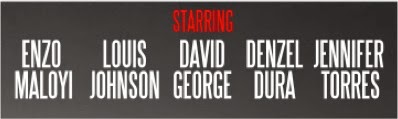
Firstly I used the same font as the credits in order to add in the names of the actors.
The process of adding in the names was simple and here is the final product:
I decided to use red for "Starring" in order to make it stand out.
After adding in the actors names I decided to add in reviews:
Firstly I wanted the ratings to be in line with the title : 'One Dream'. As a result I used the rulers tool on photoshop to help me with the alignment as you can see down below:
Here is the final product after all reviews were added:
I decided to use 'Focus' because it is the name of our Independent Film Magazine and therefore it is a source of convergence between the Poster and Magazine. Also I used 'Little White Lies' and 'Empire' because they are both film magazine however Empire is mainstream whereas Little White Lies is independent.
Finally I edited the release date. Firstly I had to change the date to July 2014 because we plan on releasing our film on the date of the opening ceremony of the olympics , however 2 years later. Also
I made 'July 2014' red in order to help it stand out and I also increased its size. Finally I removed the black background behind our company logo as it did not look professional.
Here is how the credits look now:
Firstly I used the same font as the credits in order to add in the names of the actors.
The process of adding in the names was simple and here is the final product:
I decided to use red for "Starring" in order to make it stand out.
After adding in the actors names I decided to add in reviews:
Firstly I wanted the ratings to be in line with the title : 'One Dream'. As a result I used the rulers tool on photoshop to help me with the alignment as you can see down below:
Here is the final product after all reviews were added:
I decided to use 'Focus' because it is the name of our Independent Film Magazine and therefore it is a source of convergence between the Poster and Magazine. Also I used 'Little White Lies' and 'Empire' because they are both film magazine however Empire is mainstream whereas Little White Lies is independent.
Finally I edited the release date. Firstly I had to change the date to July 2014 because we plan on releasing our film on the date of the opening ceremony of the olympics , however 2 years later. Also
I made 'July 2014' red in order to help it stand out and I also increased its size. Finally I removed the black background behind our company logo as it did not look professional.
Here is how the credits look now:
After the changes added today we feel our Poster is completed and so we will be uploading it as a draft tomorrow, before getting feedback and making our final changes if any are needed.
Saturday, 8 February 2014
Poster Draft #2 Feedback
As a group we decided to get feedback from our target audience yesterday regarding our latest draft for our film poster. Here are some of the comments which we wanted to point out:
"The poster looks very professional , I especially like the red used on the Two Mates and Two Mistakes [Titles] as it links to danger which is what the mistakes made by the two mates has caused."
"The poster is very appealing. Despite this I feel that the release date should stand out more because I had to examine the whole poster before recognising that it was positioned with the credits. However I do like this style."
"The typography used for 'SWITCH' works very well and it looks professional. Overall the poster looks very professional in my opinion , there are still a few features which need adding such as; Reviews, Actors names and Social Media links."
"Although the poster looks very professional , I feel there is to much emphasis on the sports genre."
"I like the emphasis on the sports genre for the poster and the Social-Realism hybridisation is still recognisable due to the text: "From the directors of Adulthood" which stands out due to its positioning and the use of shadow."
We are now going to amend our poster according to this feedback.
Tuesday, 4 February 2014
Poster Draft #2
This is the latest draft of our poster:
We are now going to get feedback from our target audience which we will hopefully respond to in the next couple of days.
Photo Selection Process + Adding photos in
Today we had a photo-shoot in order to get still images for our poster and independent film magazine.
We took various images to portray the Two Mates image as you can see down below
We decided to use this one because we felt that it looked real and natural also the fact that we were smiling portrayed that we were happy, this is because training was going good.
We also had many images to choose from to represent Sean's mistake as you can see down below
We decided to use this image because we felt it portrayed that we were in a relationship the best in comparison to the others.
Finally to represent Lorenzo's mistake we also had a variety of images to choose from:
We took various images to portray the Two Mates image as you can see down below
We decided to use this one because we felt that it looked real and natural also the fact that we were smiling portrayed that we were happy, this is because training was going good.
We also had many images to choose from to represent Sean's mistake as you can see down below
We decided to use this image because we felt it portrayed that we were in a relationship the best in comparison to the others.
Finally to represent Lorenzo's mistake we also had a variety of images to choose from:
We decided to use the last image because we felt it showed his anger as well as the fact that he was going down the wrong path.
I then used the quick selection tool to select the background of the image and then I erased it.
After this I placed it onto the poster.
So down below is an image of how the poster is looking now after adding the images , tomorrow we are going to get feedback on it hopefully and then we will make changes and add the final elements.
Poster Development- Adding Credits
The poster developed a lot today.
Firstly I decided to add in the credits. In our original draft we decided to use existing credits from a Paramount film. However I decided that this wasnt realistic and I searched online for a template.
Thankfully I was able to find one as you can see below:
I then filled in the template with the correct information as you can see below:
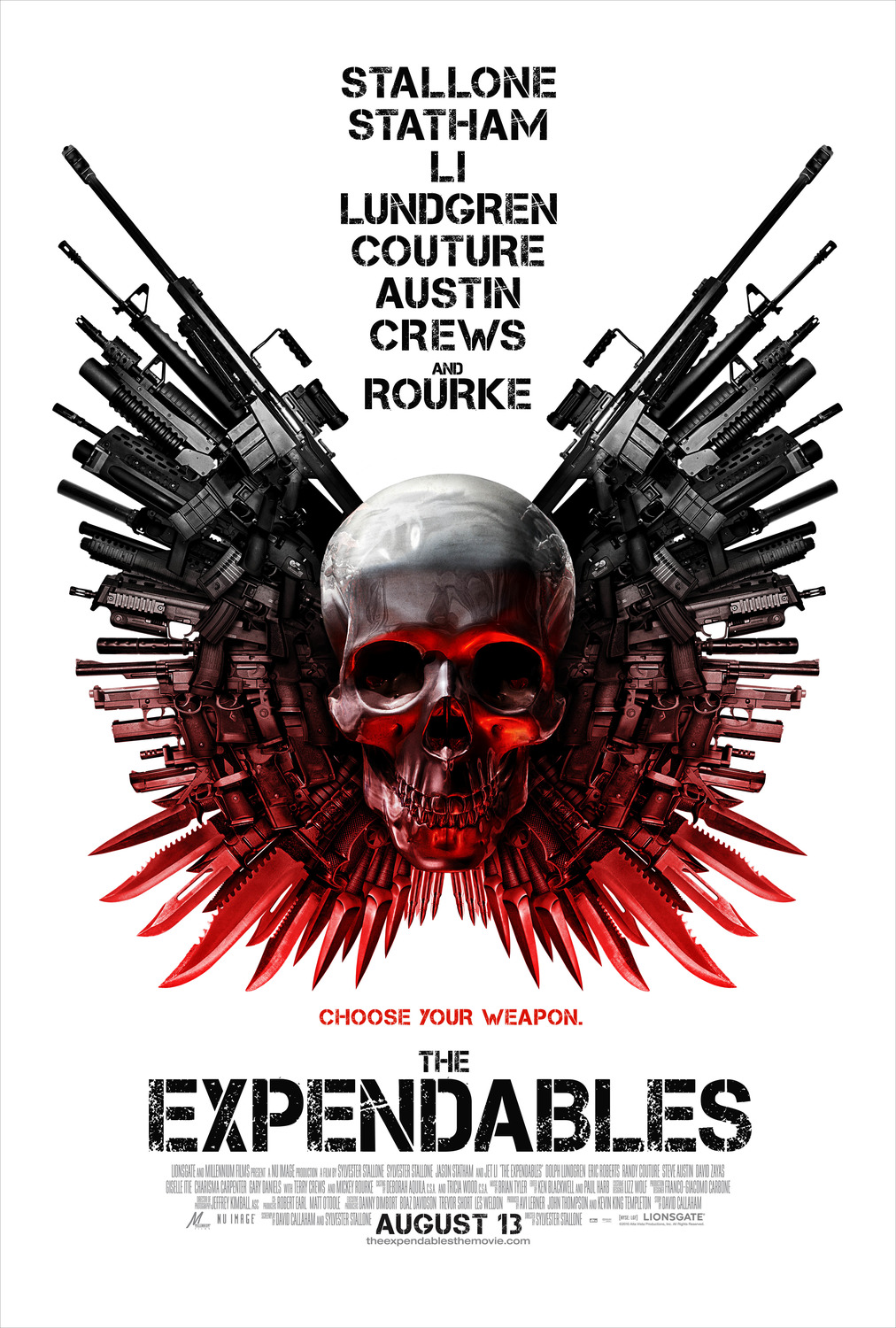
As you can see I re-arranged the template, this is because I liked the way that on 'The Expendables' poster the release date was positioned underneath the credits as exemplified below
As a result I then added in our company logo and the release date of our film, I made it white so that it would stand out. The result is down below:
The poster is starting to develop as you can see below. I felt that the poster looked more professional with the credits positioned bottom left, this led to me moving 'From the directors of Adulthood' to the top right of the poster and I feel this makes it stand out more.
Tomorrow we are going to do a photo-shoot to get images for the Poster and Magazine. After I have the images for the poster I will add them in. Once this is done I will post the poster as it looks onto the blog and then we will hopefully get feedback from our target audience.
Poster Development - Adding Titles
As I said yesterday , today I decided to add our 'slogan' onto the poster.Originally the titles were all white as you can see on the right.
I purposely positioned 'One Dream' just underneath the 'Olympic Stadium' because there dream is to compete in the Brazil Olympics.
Also on the left of Two Mates there will be an image of our two protagonists.
Furthermore on the left side of 'Two Mistakes' there will be an image of Lorenzo smoking as his mistake relates to falling into the 'wrong crowd'. Also on the other side there will be an image of Sean with Sara as this was Sean's mistake which led to him loosing Lorenzo as a mate but also as a training partner.
Also I decided to add in 'From the directors of Adulthood' as you can see below. Adulthood is probably one of the most popular social-realism films amongst our target audience and I feel that this will anchor the social-realism genre of our Trailer. Also along with the combination of the olympic stadium it anchors our Social-Realism and Sport hybridisation. Also the positioning of this text makes the manipulation of the river much less visible.
Poster Development - Adding Placeholders + Title
As a result I will have to position text to distract the viewers eyes.
I also used the gradient tool to darken the entire poster and I feel this looks much better. Also I feel this will help the colour scheme (Red , Grey and White) to stand out more.
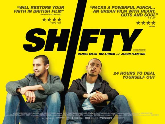
Finally I have decided to keep the original title design from our very first draft. The idea for this came from the film posters of 'Seeking Justice and 'Shifty'. I feel that this design help to make the title stand out more but also makes our poster more distinctive.
Here is the images of the 'Seeking Justice' and 'Shifty' Poster which were inspirations for our title design:
I hope to add in some original text tomorrow in order to distract the viewers eyes from the manipulation.
Poster Development - Olympic Stadium
After creating a sketched draft for our poster, I decided to start by adding the olympic stadium , this process was much harder than i expected.
While searching for images of the Olympic Stadium on Google, there was various options which I thought could work well. However the reason I chose to use this image is because it was black and white and that complimented our colour scheme.
I decided to make our poster landscape A4 and when I originally added in the Olympic Stadium image it did not fit the entire page as i wanted it to.
As a result i had to manipulate the image:
1) I selected a small part of the bottom of the river
2) Then i duplicated this part through using 'layer via copy'
3) I repeated this process until the image fitted the whole page
However as you can see it is very easy to see that the image has been manipulated so i am going to have to find a way to make this less visible.
While searching for images of the Olympic Stadium on Google, there was various options which I thought could work well. However the reason I chose to use this image is because it was black and white and that complimented our colour scheme.
I decided to make our poster landscape A4 and when I originally added in the Olympic Stadium image it did not fit the entire page as i wanted it to.
As a result i had to manipulate the image:
1) I selected a small part of the bottom of the river
2) Then i duplicated this part through using 'layer via copy'
3) I repeated this process until the image fitted the whole page
However as you can see it is very easy to see that the image has been manipulated so i am going to have to find a way to make this less visible.
Poster Development - Beginning
We have been doing a lot of work on our film trailer but have now decided to start developing the poster because we have the images we need.
Well editing the trailer I have been making an original draft which you can see below:
However we had to scrap this idea because we got feedback from our target audience and our teacher who said that although the draft did look very good it didn't really portray the social-realism and sport hybridisation of our film.
I will keep you updated on the new poster which I will hopefully be able to complete quickly so I can then start work on the Independent Film Magazine.
Thursday, 30 January 2014
A draft of the poster
We have updated our poster to a different style and layout, we have changed it from our previous poster as we believed that it didn't anchor our film genre. We worked on this poster and I then sketched it out so we could be able to plan out our updated poster. With this we believe that this anchors our genre as it shows the sub-genre of sport as the establishing image is the Olympic stadium which allows the audience to identify the narrative from looking at the poster.
We have kept with the same color palette which are Red, White and Grey.
Friday, 3 January 2014
Poster Cover Image ideas
Most of our blog has been focused on our trailer but today i have decided to give you an update on how our poster is coming along
First of all we have decided that our main character from our film (Sean Oyebanjo) is likely to take precedence on our film poster. This is simply because through our analysis of Film Posters, we found that the protagonist of the film is usually framed centrally on the poster and takes precedence.
We have been debating whether to have a full portrait of our protagonist or just a close up and so this will probably be settled by a survey which will be given to our target audience and we will take on board their advice.
There are 3 main ideas/effects which we currently like and may try implementing onto our poster
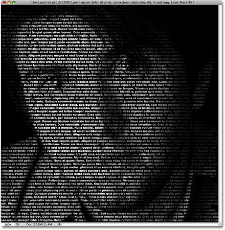
| Figure 1- Greyscale Tpography effect |
| Figure 2 - Colourful typography effect |
The first two , are shown here on the left and right. They both involve placing/using text on a portrait. The difference is one has colours and does not actually cover the face (Right) whereas the other (Left) covers the entire face and is not colourful it is actually greyscale. We like this effect because it is unique and different . In addition it would allow us to place key words from our film on our poster and we believe it would make the poster more visually pleasing.
However we also realise that there are some issues with this effect such as the fact that it may be hard for the viewer to read the words. Also if we use the effect in the way done (in the example on the right) then it may be confusing for viewers, and they may find it hard to read the other parts of the film as the cover image may take up to much space
| Figure 3- 'Half and Half' |
We also like the effect used in figure 3 because we could relate it to our own character very easily. This is because on one side we could have our protagonist before selling drugs and then the other image could be of our protagonist once he has started selling drugs. This could be done in a full portrait shot as well. We believe it would be effective as it would allow us to show the differences between our character once his life changes for example, he would dress differently when he starts selling drugs in order to fit the representations often portrayed in social-realist films. Finally it would make it clear to the viewer that our film involves a character who changes immediately and so if they like this idea they would be more likely to read the actual article
We are not certain that we will use one of these ideas but we do like them very much and we may compose a survey to see what our target audience think.
Finally we may take a break from our poster as we are currently focusing on planning, filming and editing our trailer which is taking up a lot of time and effort. However we will try to keep you updated as much as possible
Subscribe to:
Posts (Atom)